Using Astro to Build help.corso.com
We recently rebuilt our merchant-facing help and documentation site to make it easier to update, and easier to use.
User-facing documentation is an important element of good software. Sure, good software should always be as easy to use as possible, but making software perfectly intuitive is challenging when building something as powerful as the Corso app.
Our software offers a highly-customizable experience for customers and merchants alike across returns, exchanges, warranties, registrations, and shipping protection. We help merchants optimize the entire post-purchase customer experience, and making all that flexibility accessible and user-friendly is no small task.
Corso's previous help site was a hosted application that came bundled with some of our other tools. Navigation was subpar, the layout of the site wasn't great, and most frustratingly, images were pegged to their fixed column width and couldn't be made any larger. The site wasn't as speedy as it could have been, it didn't have great authoring tools, and it wasn't very good at SEO or accessibility.
Enter Astro.
Astro may best be described as the modern confluence of static site generation, server-side rendering, and selective hydration. Once upon a time, decades ago, the web was effectively just html pages that got served as files down to your browser. Once the page loaded, there was little left for the browser to do and pages were quick and responsive as the user scrolled around. As developers we progressively worked our way towards sites that require tens of megabytes of code to display ones of kilobytes of information, degrading the user experience at each step along the way.
Astro, like other static site generators before it such as Jekyll and Gatsby, takes your markdown or MDX and compiles them to a set of static HTML pages. Those pages can be hydrated as needed with dynamic javascript-based content, allowing for a best-of-both-worlds approach. Astro supports generic HTML, or other more modern UI paradigms like React, Svelte, or Cue.
Sometimes, the big SPA is the best option. Much of the software Corso builds for our users is specifically designed to offer a large amount of functionality right at the fingertip of the user. Reactivity and the display of information as close to real-time as possible is an important value that our users appreciate. Many of our merchants constantly have the software open in a browser tab, and they are actively using the application throughout the day. For them, taking a few extra seconds to load the app is worth the responsiveness they get while using it.
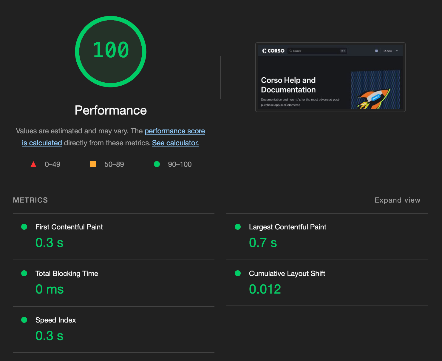
When it comes to our help site though, there's nothing for the page to do except show some text and images to the user. And this is exactly where a static site, and therefore Astro, excels. And we have the lighthouse score to prove it:

Astro supports "themes", which control functionality available to sites beyond just the basic look and feel. This includes documentation-oriented themes, one of which is Starlight. Starlight is the theme used for the official Astro documentation, so you can get a pretty good look at what it can look like.
So how do you get started with a docs page using Astro and Starlight? There's really just a few steps, assuming you have the basics like Node running on your development machine:
- Run
npm create astro@latest –- --template starlightin your terminal to start an Astro Starlight project - Run
npm run devto start the dev server. The output will tell you where you navigate your browser, often something similar tohttp://localhost:4321. - Edit the contents of the
src/content/docs/directory where you rannpm create, and watch the page update in your browser.
There's more to know than this, but not much - you can follow the specifics at the Starlight getting started page.
Once built, deployment is easy. Exactly how it's done will depend on your platform, but with a couple minutes of setup you are generally a single git commit main away from deploying a new version of your site.
How to design and implement your documentation is its own topic, but you can look at the diataxis framework as a starting point. It suggests the following distinct types of documentation:
- Tutorials, to help users learn the software
- How-to guides, for an outcome-oriented approach to certain tasks
- Reference, for detailed, topical explanations about the workings of the software
- Explanation, for the "why" behind the software
We've adapted the framework mentioned above, and we focus on writing guides, and references.
So, go check it out at https://help.corso.com. It's boring, just like a documentation site should be. But if it quickly shows you the information you need, when you need it, we helped it do its job.

