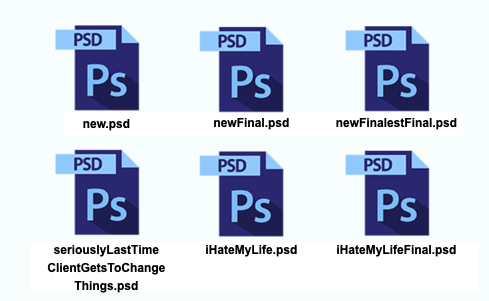
Out Of Control Design
In the typical product design process, a designer will iterate through mockups until they reach a "final" version...
...whatever "final" means...

But that's not how it has worked in the last two companies I've designed products for: Registria and Corso. These companies provide products in e-commerce, and the products are "customer-facing." The primary audience for the design is our customer's customer.
It's the well known B2B2C model.
And for this type of application the design process is completely different. As we know with e-commerce and retail, their brand is everything. This means our product has to be flexible enough to work within the brand's guidelines. It means it has to be up to par with the brand's impossibly high standards...
...I remember once getting a brand style guide from a particular high profile brand that was 300 pages long...
...sheesh.
To me, designing a product for B2B2C is the ultimate challenge. I call it "Out Of Control Design" because as product designers we don't have complete control over what the final product is going to look like. We have to think several steps in advance and create the tools that allow a design to be configured according to the brand's ever-changing needs...
...all the while not making it so complex that it is unusable or gives brands too much freedom to break things.
I got my first exposure to Out Of Control Design decades ago when I created my first Wordpress theme. The theme had a bunch of ways I could customize the theme colors, logo, and page layout. Yes, I know that drag and drop website apps are commonplace now, but back then, it was miraculous to me how all those settings got applied. It put me in control. But for whoever created the Wordpress theme, the final design of the product was an out of control experience. I could – and probably did – pick colors that no professional designer would ever choose.
So in these ways, Out Of Control Design is more than just a visual design exercise where static mockups are used to get consensus on a final version. Out Of Control Design requires in depth technical collaboration.
As for Corso, while our actual product design is much less intense than an entire website theme, we still have some Out Of Control Design going on. Just look at a few of the designs that are now out in the wild.


I know what you're saying, "It looks like just a couple lines of text with a boring checkbox. How hard can that be?"
Well, to accommodate just these designs, there are over 30 different configurable variables which can be used to alter the features, colors, and language. To keep it simple, we allow the customer to pick from a few different templates and then our team is able to tweak the design behind the scenes so that it matches their branded website theme perfectly. We are usually able to do this in just a couple minutes without any complicated hoops for our customers to jump through. So far we've been able to accommodate all our customers' wildly different e-commerce sites without any custom engineering or development.
I've been designing and building products across a few industries over the past 15 years, and this one has been by far the most challenging and the most fun...
...even though, yes, it is just a couple lines of text and a checkbox.
Because by understanding Out Of Control Design, we are able to accomplish a few key things for our business:
- Quickly and efficiently onboard new clients
- Make sure the design fits perfectly and discreetly within the brand's theme
- Test and optimize the widget for conversion
- Keep our development resources free to create new features and innovative products.
These are the types of challenges that make designing products for Corso fun. I've always loved the process of creating a great product design and user experience, and when you add the complexities that go along with Out Of Control Design, it forces us to step it up another level.
The current design of our Shopify App, Green Shipping Protection, has been stable for several months now. It kinda feels like we are in a phase of something like Version_3_Final_2_Latest. But I'll be honest...
...I definitely had some dark periods of I_Hate_My_Life in order to get to where we are...
...And IDK, maybe going through all the stages of design hell is the tell-tale sign that you've spent enough time to make something worthwhile.

